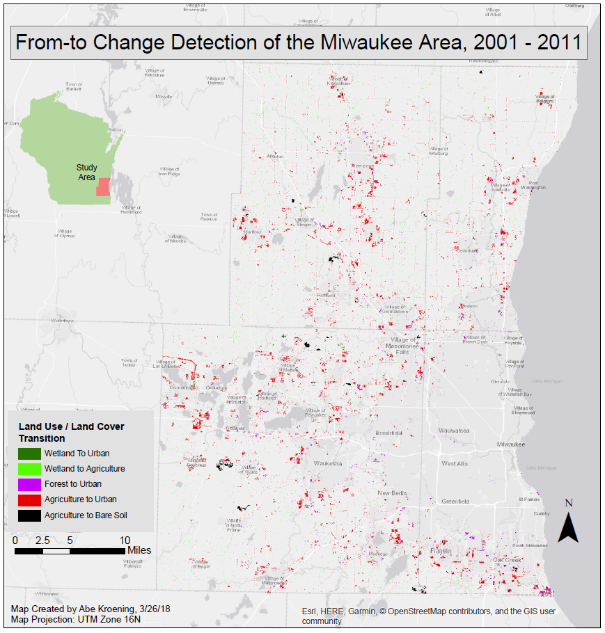
Thursday, December 13, 2018

Monitoring Mining Induced Land Use / Land Cover Change in the Athabasca Oil Sand Mining District of Northeast Alberta

This project measures the growth of the Athabasca Oil Sand Mining District in northeastern Alberta.
A detailed report for this project, 29 pages in length was written for this project, which can be found here: Report on Monitoring Mining Induced Land Use / Land Cover Change in the Athabasca Oil Sand Mining District of Northeast Alberta. Many different GIS and remote sensing techniques were used in this project including:

  • Creating maps displaying the change in land use / land cover (LULC) and increase in mine area.
  • Using Model Maker in Erdas, which is similar to Model Builder in ArcMap, to determine the LULC changes over five different time steps.
  • Calculating the change in LULC classes over the time intervals in Excel.
  • Performing atmospheric and radiometric correction on Landsat 5 imagery in Erdas.
  • Executing object based classification with Ecognition.
  • Improving the classification using Knowledge Engineer in Erdas.
  • Doing an accuracy assessment using Google Earth Pro, Erdas, and ArcMap.
The report also includes a literature review to help compare the project to similar studies.

Friday, April 27, 2018

Lab 10: Radar Image Functions

Introduction

Radar remote sensing is an active remote sensing system that collects data from the microwave portion of the electromagnetic spectrum. The goal of this lab is to be introduced to radar remote sensing. This will be done by executing the following miscellaneous image functions on radar images:
     1. Noise Reduction
     2. Spectral and Spatial Enhancement
     3. Multi-sensor Fusion
     4. Texture Analysis
     5. Polarimetric Processing
     6. Slant-range to Ground-range conversion

Methods

1. Noise Reduction
Noise reduction was performed by despeckling radar images. Noise reduction attempts to eliminate or lower the amount of salt and pepper affect present in an image. Noise reduction was performed using Erdas Imagine using the Radar Speckle Suppression tool. This tool was ran 3 times. The first time, the original image was used, the subsequent times, the output image of the previous run was used. Figure 1 shows the parameters entered for the 1st run. 

Fig 1: Radar Speckle Suppression Tool
After all the despeckles were ran, a comparison of the histograms was done to see how the pixel values changed.


2. Spectral and Spatial Enhancement
This was performed by executing edge enhancement using the Non-directional Edge tool in Erdas Imagine. The parameters for this tool can be seen below in Figure 2. Speckle suppression was performed on the output of this image for trial number 1, and speckle suppression was performed on the input image for trial number 2 to see whether it is better to despeckle before or after edge enhancement.

Fig 2: Non-directional Edge Tool Parameters

Also, the Radar Speckle Suppression tool was used, but this time, the Wallis Adaptive filter was used. This filter adjusts the contrast stretch of an image defined by the moving window size. for this, a 3x3 window was used.

3. Multi-Sensor Fusion
To perform this, the Sensor Merge tool was used in Erdas Imagine. The parameters for this tool can be seen below in Figure 3. This tool takes a radar image and merges it with a Landsat image.
Fig 3: Sensor Merge Parameters


4. Texture Analysis
This was executed by using the Texture Analysis tool. Using this tool, texture can be quantified which can be important for vegetation analysis and determining vegetation species. This tool was ran in Erdas Imagine as well.

Fig 4: Texture Analysis Parameters

5. Polarimetric Processing
The rest of the lab was performed using ENVI. To execute polarimetric processing, first the images were synthesized by using the Synthesize SIR-C Data tool. Each of the combinations (HH, VV, HV, and TP) were chosen to be synthesized. The parameters for this tool can be seen below in Figure 5.

Fig 5: Synthesize Parameters
Fig 6: CEOS Header Report
Synthesization was performed using different parameters on different images to experiment and to see the different outputs. After this, the results were seen using the histogram, and the stretch method used to display the histogram was altered with using the Gaussian, linear, and square root stretching schemes.

6. Slant-range to Ground-range conversion
This was performed by first previewing the CEOS Header seen in Figure 6 and then by resampling an image using the Slant to Ground Range SIR-C tool. The parameters for this tool can be seen below in Figure 7. The ground spacing in found in the header report was used as the output pixel size in the conversion.
Fig 7: Slant-Ground Parameters


Results

Figure 8 shows the differences between the histograms when despeckling an image. The histograms show that as speckle suppression is performed run after run, the contrast in an image becomes greater. Also, the histograms starts to become more bi-modal than normal.

Fig 8: Comparing the Histograms of Each Speckle Suppressed Output

Figure 9 shows the result of the final Speckle Suppression run and compares it to the original image. The original image is shown on the left, and the final speckle suppressed image is shown on the right. Overall, the speckle suppression did eliminate some of the salt and pepper effect, but now the image appears to have worms in it.
Fig 9: Comparing the Speckle Suppressed Image With the Original Image

Figure 10 shows the compares results of the spatial enhancement performed before and after speckle suppression. The image on the left shows the result of performing the edge enhancement without speckle suppression, and the image on the right shows the result of the edge enhancement performed after speckle reduction. Based on the visual result of the images, the image which include speckle suppression is cleaner and smoother.

Fig 10: Comparing Performing Edge Enhancement With and Without Performing a Speckle Suppression First

Figure 11 shows the result of merging the radar imagery with the Landsat TM imagery. This is by far, the coolest output in this lab. The input Landsat image is shown on the left, while the output merge image is shown on the right. The main difference between the two is the colors. The Landsat image only has green, white, and black colors while the merged image has many more colors. The other main difference is that no clouds are present in the merged image. This is because the radar sensor signals can travel through clouds.
Fig 11: Comparing the Merged Output from the Input Landsat TM Image

Figure 12 shows the result of performing texture analysis. The image from which the texture was derived is shown on the left while the texture values are shown on the right. Pixels with a higher texture value are shown in white while pixels with a lower texture value are shown in black.
Fig 12: Result of Performing Texture Analysis

Figure 13 shows the result of synthesizing the radar imagery. This output doesn't appear very satisfying and almost looks like a point cloud. However, the output looks similar to that of a true color image.

Fig 13: Result of Synthesizing a Radar Image

Figure 14 shows the result of performing the slant to ground range conversion. non-corrected image is on the left while the corrected image is on the right. The main difference is the horizontal stretch apparent in the the corrected image. All other qualities of the image appear to be the same. This is because the line spacing found in the header report was used to increase the pixel size in the horizontal direction.
Fig 14: Comparing Slant - to Ground Range Conversion


Sources

Envi, 2015. Radar Imagery
Erdas Imagine, 2016. Radar Imagery
Wilson, C (2017) Lab 10 Radar Remote Sensing retrieved from
      https://drive.google.com/open?id=1POzdEKzH3HaIDzS04S2tZ31PCnoe5VKz

Monday, April 23, 2018

Lab 9: Hyperspectral Remote Sensing

Introduction


The goal of this lab is become a bit more familiar with ENVI software by using hyperspectral satellite images to perform some basic function in ENVI including atmospheric correction with FLAASH, vegetation index calculation, calculating agricultural stress, calculating the fire fuel, calculating forest health, and by performing a minimum noise fraction (MNF) transformation. Before these function were performed, hypersepctral statistics were looked at using a z-profile, and animation was created between bands.

Methods


View Hyperspectral Bands and Look at their Statistics
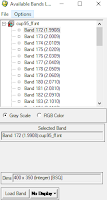
Fig 1: Loading Hyperspectral Bands
This was done by opening up ENVI and loading a hyperspectral image in a viewer. Once the image was loaded. One is able to see the hundreds of bands which are available to be loaded. These bands can be seen at right in Figure 1. Next, regions of interest (ROI) were uploaded for the image using the restore ROIs function. Next, a plot was created for the ROIs. This plot was set to show the mean band reflectance and to display the minimum and maximum band reflectance values in the statistics immediately below it. This figure is shown in the results section.

Animate a Hyperspectral Image
In ENVI, animation can be created between bands. This is done by using the animation tool. Different parameters can be set to speed up or slow down the animation. Also, the area showing the animation can be edited.

Perform Atmospheric Correction
This was done using the FLAASH Atmospheric Correction tool. The parameters for this tool can be seen below in Figure 2. This tool resulted in an atmospherically corrected image.

Fig 2: Atmospheric Correction Parameters
After the image was corrected for, the original z-profile was compared with the corrected z-profile.

Calculate Vegetation Index
This was done by using the calculating vegetation index tool. Before entering in the parameters for this tool, a false color NIR band combination was loaded into a display.
Fig 3: Vegetation Index Paramters
This tool outputs many different images which show NDVI, simple ratio index, enhanced vegetation index, red edge normalized difference vegetation index, and many others.

Calculate Agricultural Stress
This was done using the agricultural stress tool.This tool is used to see where crops are stressed or not. This tool is used to see where plants are more efficient than others in using their available nitrogen, light, and moisture.

Calculate Fire Fuel
This was down using the Fire Fuel tool. This tool uses the NDVI index and the water band index to see where there is the most available fuel if a forest fire occurred. For this tool, because it'd be unnecessary to include urban areas, these areas were masked out using a mask. The parameters for this tool can be seen below in Figure 4.
Fig 4: Fire Fuel Parameters
Calculate Forest Health
This was done using the Forest Health tool. The parameters for this tool can be seen below in Figure 5. This tool is uses the distribution of green vegetation, the concentration of stress for leaf pigments, the concentration of water in the forest canopy, and forest growth rates to create an overall forest's health.

Fig 5: Forest Health Parameters

Perform Minimum Noise Fraction (MNF) Transformation
This was done by using the Estimate Noise Statistics From Data. The parameters for this MNF transformation can be seen below in Figure 6. To make the transformation be performed quicker, only the 20 bands between wavelengths 2.04 and 2.439 were used in the calculation. Also, the transformation was only performed on a small (20 x 20 pixel) subset of the original image.
Fig 6: MNF Parameters


Results


Figure 7 shows the animation created. This animation loops through bands 197 to 216 of the hyperspectral image. One can see how the bands all appear slightly different in this short video.
Fig 7: Animation Video

Figure 8 compares the results of the vegetation z-profile from the image that was atmospherically corrected to the image that wasn't. The corrected images profile is shown on the right while the original image's profile is shown on the left. One can see that the corrected image's profile looks as it normally should while the the original image's profile does not.

Fig 9: Comparing Vegetation Spectral Profiles
Fig 8: Comparing Vegetation Spectral Profiles

Figure 9 shows the NDVI image produced by running the Calculate Vegetation Index tool. This image shows that NDVI is high in the west and low in the east. This is because a forest resides in the western part of the image while a city resides in the eastern part of the image.

Fig 9: NDVI Image
Fig 9: NDVI Image
Figure 10 shows the Simple Ratio Index also calculated by the Calculate Vegetation Index tool. This result shows that high values are located in the middle of the image while lower values are on  the outskirts.

Fig 10: Simple Ratio Index Image
Figure 11 shows the results of the Red Edge Normalized Vegetation Difference Index also calculated by the Calculate Vegetation Index tool. This is pretty much a normalized NDVI image. This image shows that the healthiest vegetation is in the southern middle part of the image while poor vegetation health is in the eastern part of the image where the town is located. This is because of roads and man-made features.

Fig 11: Red Edge Normalized Vegetation Difference Index Image

Figure 12 shows the result of Agricultural Stress tool. It appears the most of the forest which is located in the western part of the image isn't stressed while, the vegetation located in the urban town is pretty stressed.
Figure 12: Agricultural Stress Output


Figure 13 shows the result of the Fire Fuel tool. Most of the fire fuel seems to be located around roads in the urban area which isn't much of a concern. The forest looks fairly moist which means that the fire fuel value is low.
Fig 13: Fire Fuel Output


Figure 14 shows the result of the Forest Health tool. This image shows that the forest health is very good across the forested area and is poor in the urban area. Red areas represent healthy forest while blue/purple areas represent an unhealthy forest. Based on this, the forest appears very healthy in the southwestern part, and moderately healthy in western part of the image.
Fig 14: Forest Health Output


Figure 15 shows the result of the MNF transformation's plot. The is an exponential inverse relationship between the eigenvalue and the eiganvalue number. A low egenvalue number will have a high eigenvalue, while a high eigenvalue number will have a low eiganvalue.
Fig 15: MNF Transformation Plot

Sources


ENVI, 2017. ENVI basic and Advanced Hyperspectral Analysis dataset
      http://www.harrisgeospatial.com/Support/SelfHelpTools/Tutorials.aspx
Wilson, C (2017) Lab 9 Hyperspectral Remote Sensing retrieved from
      https://drive.google.com/open?id=1tLLd6zyeLqslKT3heVtu19qtmNuZQisK

Thursday, April 12, 2018

Lab 8: Classifying Imagery With the Expert System and ENVI

Introduction

The first goal of this lab is to improve image classification accuracy using the expert system in Erdas ancillary zoning and other data of the Eau Claire and Chippewa area. The second goal is to perform artificial neural network image classification of Northern Iowa's campus using ENVI software. the expert system is the best of the image classification systems as it uses ancillary data such as elevation, demographics, income, and zoning to refine an already classified image. Using the expert system has been used to generate accuracy as high as 94%. In this lab, only qualitative assessment will be performed. Also, a map of the classified image will be created.

Methods


Using the Expert Classification System
The expert classification is more of a reclassification than it is a classification. This is because to use the expert classification system one needs to already have a classified image. In this lab a classified image of Eau Claire and Chippewa area was used. This classified image had many incorrectly classified areas. These areas mainly included golf courses, cemeteries are other urban areas.

Set up the Knowledge Engineer
The Knowledge Engineer is the interface for which the expert system is used in. It can be opened by navigating to Raster → Knowledge Engineer → Knowledge Engineer. The Knowledge Engineer window can be seen below in Figure 1.

Fig 1: Knowledge Engineer Window
In the window, hypotheses, rules, and variables are added to help reclassify the imagery. Hypotheses appear in green, rules appear in yellow, and variables appear in blue.

Each rule applies to ancillary data. For example, an area that is classified for agriculture in the original image, but is in a zoning class of residential, the classification for areas that are classified as agriculture in residential areas can be changed from agriculture to urban by assigning rules.

An example of a rule can be seen below in Figure 2. For the input raster (ancillary data) which is assigned to the variable GV_agric. When, this variable has a class value of 1, the classified image cannot have that pixel be assigned to a value of 4. For pixels which are assigned a pixel value of 4, their values are changed to 1.

Fig 2: Rule for Agriculture
Similar rules like this were written for urban, residential, green vegetation and other urban classes. The hypotheses, rules, and variables for these can be seen below in Figure 3.

Fig 3: Hypotheses, Rules, and Variables Used
Perform the Classification
To run the expert classification, one can click navigate to the Knowledge Classifier window. The classification scheme which is set up above is brought in. Then, the next button is clicked. Then, some parameters are changed so that the "set window" is changed from Intersect to Union. This can be seen below in Figure 4. The Set Window window is open by clicking on the Set... button. Then, the output is specified and the tool is ran.

Fig 4: Running the Classification
Lastly, a map of the output is created in ArcMap.

Using ENVI to Classify Imagery
Neural network classification imitates the way a human would classify imagery. It uses ancillary data along with weights and hidden layers to classify the imagery. To perform neural network classification in ENVI, first the image of the University of Northern Iowa's campus is loaded into a viewer. The band combination is set to NIR, Red , Green as this is a typical band combination for classifying imagery.

Then, training samples are collected (called ROI's in ENVI) by using the #ROI Tool window. This window with the filled training samples can be seen below in Figure 5.

Fig 5: Collected ROIs (Training Samples)
Next these training samples are used to help run the classification. This is done by navigating to Classification → Supervised → Neural Net on the main toolbar. Then, in the Neural Net Parameters window, the parameters are changed to set the training rate, training momentum, and the number of training iterations. Each of these parameters will affect how the image will be classified. Lastly, the output is saved to a folder.

The classification was ran a few times with each time altering the number of iterations to see how the number of iterations affects the classification of the imagery.

Results


Figure 6 shows the map created in ArcMap of the classified system using the expert system. Areas that changed the most from the original classified image include cemeteries, golf courses, and other urban areas such as the mall and sand mines. The class "other urban" was created because zoning data was used to help classify the imagery. If the zoning data was residential, then areas classified as urban were classified as other urban. This is why areas such as the airport, the mall, and industrial complexes are classified as other urban.

Fig 6: LULC Map Created Using the Expert System

Figure 7 shows the results of the neural classification performed in ENVI using 100 iterations. The red areas represent roofs, the blue areas represent green vegetation, and the green areas represent asphalt ans sidewalks.
Fig 7: Neural Network Classification
Figure 8 shows the results of comparing the number of iterations. To help see the differences, only a small portion of the campus is pictured at a very large scale. It appears that the image with more iterations is slightly smoother than the image which was produced using fewer iterations. This can be see by comparing the roof tops located on the right side of each image. Although, the output is smoother, the more iterations that are ran, the longer it takes to produce the output image.
Fig 8: Comparing the Number of Iterations

Sources

United States Geological Survey, (2017). Earth Resources Observation and Science Center
University of Northern Iowa Geography Department (2016) Quickbird High resolution imagery
Wilson, C (2017) Lab 8 Expert System Classification retrieved from
    https://drive.google.com/file/d/15fOh_xcupGKzPqZixYQguXm3yex0VJDa/view?usp=sharing

Friday, April 6, 2018

Lab 7: Object Based Classification

Introduction

The goal of this lab is to use eCognition software to classify Landsat TM imagery of Eau Claire and Chippewa counties using the Random Forest and Support Vector Machine classifiers, and is to classify high resolution imagery (3.4 cm) using the Support Vector Machine classifier. Another goal of this lab is to become familiar with the eCognition software and understand how to classify imagery with it. Two different maps will be created. The first map will show the difference in the output generated by the Support Vector Machine classifier and the Random Forest classifier of Eau Claire and Chippewa counties, and the second map will show the classified image of the high resolution UAS imagery.

Methods

Classify Landsat TM Imagery Using the Random Forest Classifier

Prepare the imagery
To do this, first, the Landsat image was brought into the eCognition software. Next, in the Assign No Data Values window opened from the Create Project Dialog window, the check box to exclude pixels with no data was checked.

Next, the band combination was changed from blue, green, red, to NIR, red, green. This was changed because the delineation of objects is easier using this band combination than it is using the blue, green, red band combination. To change the band combination, one can open the Edit Image layer Mixing window from the main toolbar.

Segment the Imagery
To segment the imagery, a process was created in the Process Tree which was given the name "Lab7_Object_Classification" was created. A sub-process was then added called "Generate Objects" This sub-process was assigned to execute its child processes. Then, a child process given a default name was created. In this process the settings were changed as they appear in Figure 1 below. The scale parameter is a very important parameter in the window below. Set this parameters to large or too small and it will affect the accuracy of the classified output significantly.
Fig 1: Edit Process Window for Creating Objects on the Landsat Imagery

The objects which this process created can be seen below in Figure 2. Assessing the objects is a visually and qualitative task. It is up to the analyst to determine whether the objects group pixels well or if they don't. Based on the output below, the objects seem to group pixels well, so the process to classify the imagery can be continued.
Fig 2: Objects Created from the Process Executed in Figure 1.
Collect Training Samples and Define Classes
First, the classes which will be used in the training samples and in the classification are defined. They are defined in the Class Hierarchy window. Classes are added by right clicking in the window, clicking on "Insert Class" and then by entering in the name of the class and its assigned color. Figure 3 shows the classes used for the Random Forest classifier.
Fig 3: LULC Classes Used
The training samples are then collected by highlighting the "sample objects" button, having a LULC class selected and then by double clicking on the corresponding objects in the viewer. Ten samples were collected for forest, 20 for urban/built-up, 10 for water, 15 for Green vegetation/shrub, and 15 for bare soil.

Train and Apply the Training Samples and Classifier
The first step is to navigate to the Manage Variables window which is found under the Process tab. In this window, a scene variable is created to have a string data type and is given the name "RF Classifier". The next step is to create a sub-process within the RF Classification sub-process. This process is called "Train RF Classifier" and is called to execute its child's processes. A child is then inserted in this sub-process and is given the parameters as seen below in Figure 4. the Features parameters are accessed by clicking on the "..." button on the right side of its text box. Then, the "Brightness, Mean Layer 1, Mean Layer 2, Mean Layer 3, Mean Layer 4, Mean Layer 5, Mean Layer 6, max. diff, GLCM Dissimilarity (all dir.), and GLCM Mean (all dir.)" layers are added to be used in applying classifier. This child is then executed. 
Fig 4: Train the Classifier Parameters
To apply the classifier, a new sub-process was created within the RF Classifier sub-process called "Apply RF Classifier". Then, a child was inserted within this sub-process. This child's parameters can be seen below in Figure 5. The child is then executed. 
Figure 5: Apply the RF Classifier
Make Edits to the Classification Output Image
There are two different ways to make edits to the classification output. One way is to tell the eCognition software two or three different LULC classes which it commonly classified incorrectly and then rerun the process within the Apply RF Classifier sub-process. This is done by reopening the child within the Apply RF Classifier and changing the "Class filter" parameters from "none" to the desired LULC classes which need to be fixed. Then, the child is executed. This can be done a few times to help clean up the classification. If this isn't working well, the second way to edit the objects is to do it manually. This is done by accessing the manual editing toolbar underneath the View tab and then chaining the "Select Class for Manual Classification" drop down list to the desired LULC which the analysts wishes to change an object on the map to. Then, once the appropriate LULC class is present in the list, the desired object is click on to change the LULC class. This can be as many times as the analyst determines is necessary. Once the manual edits are made, the map is then exported as a .tiff so a map of the output can be created in ArcMap. Once complete, the process tree for the Random Forest classification should look like it does in Figure 6 below.
Fig 6: Random Forest Process Tree


Classify Landsat TM Imagery Using the Support Vector Machine Classifier

Prepare the imagery
This is done exactly the same as explained in the Random Forest classifier section.

Segment the Imagery
This is done exactly the same as explained above in the Random Forest classifier section.

Collect Training Samples and Define Classes
The classes are created same way as explained in the Random Forest classifier section as well as the training samples. A new set of training samples is collected using about the same number of training samples per class as explained in the Random Forest classifier section.

Train and Apply the Training Samples and Classifier
This is done similarly as explained in the Random Forest classifier section above, but the process is named to correspond with the Support Vector Machine classifier rather than the Random Forest classifier. The parameters entered in the child are also different and are shown below in Figure 7. This child is then executed.
Fig 7: Train the SVM Classifier
Next, the apply process is created within a new sub-process just like for the Random Forest classifier. The parameters for this child can be seen below in Figure 8. This child is then executed.
Fig 8: Apply the SVM Classifier
Make Edits to the Classification Output Image
Lastly, edits are made on the SVM classified output the same way as explained in Random Forest classifier section. Then, the output is exported as a .tif so a map can be created ArcMap. The process tree for the Support Classification classifier should look like it does in Figure 9.
Fig 9: Support Vector Machine Process Tree

Classify High Resolution UAS Imagery Using the Support Vector Machine Classifier

Prepare the imagery
This is done exactly the same as explained in the Random Forest classifier section.

Segment the Imagery
This is done exactly the same as explained above in the Random Forest classifier section except that the scale parameters is changed from 9 to 180.

Collect Training Samples and Define Classes
The classes are created same way as explained in the Random Forest classifier section as well as the training samples. A new set of training samples is collected incorporating the following classes: shadow, asphalt, roof, grass, and tree.

Train and Apply the Training Samples and Classifier
This is done similarly as explained in the Random Forest classifier section above, but the process is named to correspond with the Support Vector Machine classifier rather than the Random Forest classifier. The parameters entered in the child are the same as shown in Figure 7. This child is then executed. Next, the apply process is created within a new sub-process just like for the Random Forest classifier for the Landsat imagery. The parameters for this child are the same as seen in Figure 8. This child is then executed.

Make Edits to the Classification Output Image
Lastly, edits are made on the SVM classified output for the UAS imagery the same way as explained in Random Forest classifier section. Then, the output is exported as a .tif so a map can be created ArcMap. The process tree for the Support Classification classifier should look like it does in Figure 10.
Fig 10: Support Vector Machine Process Tree for the UAS Image

Results

Figure 11 shows the two classified images of the Landsat TM imagery using the Random Forest and Support Vector Machine classifiers as explained above. It appears that the output created using the Support Vector Machine classifier classified the imagery better than the Random Forest classifier. This is evident by looking at the urban LULC class. In the Random Forest classifier, based off of what the analyst knows of the LULC of the study area, it appears as though many agriculture and bare soil LULC classes are mis-classified as urban. Also, it appears as though many areas that should be classified as forest were classified as vegetation / shrub. This can be seen by looking at how there is more homogeneity to the forest LULC class in the output generated by the Support Vector Machine classifier than there is in the output generated by the Random Forest Classifier.
Fig 11: LULC Maps Created Using the Random Forest and Support Vector Machine Classifiers
Figure 12 shows the classified image of the high resolution UAS imagery using the Support Vector Machine classifier. Overall, the classification is pretty good. The classifier visually appears as though it had a difficult time differentiating between the roofs and asphalt LULC classes. This output does however look visually satisfying. Object based classification is really meant for classifying high resolution UAS imagery rather than classifying Landsat imagery. This is why the output of the UAS imagery is much more clear than that of the Landsat imagery. If pixel based classification were to be ran on the UAS imagery, the salt and pepper effect would be very present compared to the output below.
Fig 12: Object Based Classified Imagery Using Support Vector Machine on High Resolution UAS Imagery

Sources

Esri, 2017. US Geodatabase
United States Geological Survey, (2017). Earth Resources Observation and Science Center
UWEC Geography & Anthropology UAS Center, (2016) Mikes House Imagery
Wilson, C (2017) Lab 7 Object Based Classification retrieved from
    https://drive.google.com/open?id=1DSAZ310x3SeQMhscuTs0RUw4cv_5T9Ze

Tuesday, April 3, 2018

Lab 6: Write Memory and Post-Classification Change Detection

Introduction

The goal of this lab is to perform write function memory change detection and post-classification change detection on Landsat TM imagery. Write memory change detection is a quick way to analyze an image qualitatively while post-classification change detection is a more in depth method that allows for one to quantify the from-to change of LULC. 

Methods

Write Function Memory Insertion Change Detection
Write Function Memory Insertion is a simple way to visually see change over an area over a given period of time. It is quick to perform, but it doesn't provide the user with any quantitative data. In this part of the lab, Landsat imagery from 2011 and 1991 of west central Wisconsin will be used.

The first step to performing this change detection is creating a layer stack of the red band of the newest image, and the two near infrared bands of the old image. After this composite image is created, the bands which go into the blue, red, and green channels are changed so that the red band of the newest image is inserted into the red chanel, and the two near infrared bands of the older image is inserted into the green and blue channels. This is done in the Set Layer Combinations window which can be found in the Multispectral tab in Erdas. The Set Layer Combinations window for this image is shown below in Figure 1.
Fig 1: Set Layer Window
Post-Classification Comparison Change Detection
Post-classification change detection is a much more in depth method than the write function memory insertion technique is. In this lab, LULC from 2001 and 2011 of the Milwaukee Metropolitan Statistical Area (MSA) will be used. Post-classification change detection allows for the determination of from-to change of a given LULC for a given pixel.

Before this, though, a chart of the from-to change detection was created using the raster attributes of both LULC datasets. This table was created in Excel to show the area in Ha for each LULC class as well as the percent change in LULC for each class.

To create a from-to change map using the post-classification comparison change detection method. The equation used to determine the changes is shown below in Figure 2, and is explain below.
Fig 2: Equation used to determine change for each LULC class
Below is a list which explain what all the symbols mean in the equation.
     1. ΔLUC = the from-to change class
     2. IM1 = the classified image for date 1
     3. IM2 = the classified image for date 2
     4. v1….vn = Class values
     5. vt = classes not interested in for a particular sub-model
     6. set{0,1}= mask classes not interested in but highlight interested class.
     7. 1a = From pixel value of interested class.
     8. 1b = To pixel value of interested class.

This equation is then used to create a model in Erdas. To save time, a single model was created using the two LULC rasters as inputs and all of the LULC change sub models were inserted into a single model. Therefore, the model will output 5 different rasters which show the from-to change for each LULC class. 
Fig 3: Full model
Fig 3: Full model
To help explain the model, Figure 4 shows just the part for the Urban/Built up LULC from-to change.
Fig 4: Model for Urban/built up for from-to change
In the first function of the model the equation used is "EITHER 1 IF ($n1_milwaukee_2001==7) OR 0 OTHERWISE" for the 2001 input raster and is "EITHER 1 IF ($n2_milwaukee_2011==7) OR 0 OTHERWISE" for the 2011 input raster. Then, these values are concatenated using another function by using the concatenation operator so that the function reads " $n30_memory & $n31_memory ". Similar statements were added to the model for the corresponding input functions to complete the model. After the statements were written in the model, the model was ran.

Results

Figure 5 shows the output of executing write function memory change detection. The areas that changed the most are shown in red, and the areas that changed the least area shown in blue. Based on the image, it appears that urban areas changed more than agricultural and forested areas. This is probably because buildings were constructed, roads were built, and other infrastructure was created near the populated areas while agricultural areas did not have this occur.
Fig 5: Write Memory Change Detection Outut
Figure 6 shows the table created from the data in the raster attributes of the 2000 and 2011 images. The table shows that water, wetland, urban/builtup, forest, and agriculture didn't change very much, and shows that open space, and bare soil LULC changed quite a bit when comparing the 2011 image to the 2000 one. However, it is important to note that only 1000 more Ha were classified as bare soil in 2011 than in 2000 while having a 72% change, and that 2500 more Ha were classified as Urban/built up in 2011 than in 2000 coming to only a 2.7% change. It is important to remember that the percent change column is only relative to the original Ha LULC value.
Fig 6: Changed in LULC in Milwaukee MSA

Figure 7 shows a map of all the from-to change rasters created in the large model in Model Maker. This map shows that visually, it appears that most LULC change that occurred was from agriculture to urban. This is most likely because the Milwaukee area population is growing and in order for more houses to be created agricultural areas must be turned into houses. This map also helps show that there wasn't much wetland to agriculture change in the Milwaukee area, and that there wasn't much wetland to urban change in the Milwaukee area either.
Fig 7: From-to LULC change map created using post-classification comparison change detection

Sources

Esri, 2017. US Geodatabase
United States Geological Survey, 2017. Earth Resources Observation and Science Center
Multi-Resolution Land Characteristics Consortium (MRLC), 2011. National Landcover Dataset
Wilson, C (2017) Lab 6 Digital Change Detection retrieved from
    https://drive.google.com/open?id=1poMZ9VtbA_F-mknQlM5dvf5WDylELvN-