Monday, March 12, 2018

Lab 5: Accuracy Assessment of Image Classification

Introduction

  The goal of this lab is to create and interpret an error matrix using Erdas Imagine for the second classified image from Lab 3 using unsupervised classification and for the classified image produced using supervised classification in Lab 4. There are two main steps in creating the matrix: (1) collecting ground reference points and enter in truth values, and (2) creating the matrix from the accuracy points table.

Methods

Step 1: Collect Ground Reference Points and Enter in Truth Values
  
First, the unsupervised image will be used to create a matrix, so the unsupervised image was added to a viewer. Then, the reference image was added to a different viewer. The reference image is a higher resolution RGB image of Eau Claire and Chippewa counties. After this, the Accuracy Assessment window was opened for the classified image by navigating to Raster → Supervised → Accuracy Assessment. Then, the classified image was opened in the window. The Select viewer to display random points button was then used to set the reference image. To create the random points in this image, under the edit tab, the Create/Add Random Points... button was clicked to open up the Add Random Points window. In this window, the number of points was set to 125, the sampling scheme was set to stratified random, the minimum number of points per class was set to 15, and the 5 LULC classes were selected to be used only. When these points were created, for some reason, Erdas would only allow for 250 points to be created, so instead of the entered in value of 125 points, 250 points were used in the accuracy assessment. To attempt to eliminate bias in the accuracy assessment, at this moment, the viewer which contained the classified image was deleted as it was no longer needed, and would only be used to artificially increase the accuracy. It is important to collect the reference values without knowing what the classified image classified the points as
 
  To enter in the truth values, the assessment points were added to display 10 at a time to allow the author of this article to more easily find the location of the points. If all the points were added to the display at the same time, it would have taken a long time to find each assessment point because there were 250 of them. LULC values were entered as their classified raster value. This is 1 for water, 2 for forest, 3 for agriculture, 4 for urban/built up, and 5 for bare soil. To verify when a value for a point was entered into the table, the color of the point was changed to turquoise. If a value hadn't been entered in for the truth value yet, the color was set to white. One more important thing to mention here, is that if an assessment point was right on the border between two LULC classes, it was deleted. In total, 12 points were deleted. It is also important to note that to make sure the output matrix has at least 90% confidence, at least 250 assessment points should be assessed. However, only 250 points were used in this lab to save on time. Figure 1 below is a screenshot of the accuracy points and the corresponding table after the truth values had been entered in. Notice how all of the assessment points are turquoise and that the reference values are populated in the appropriate cells. After this, the table was saved.
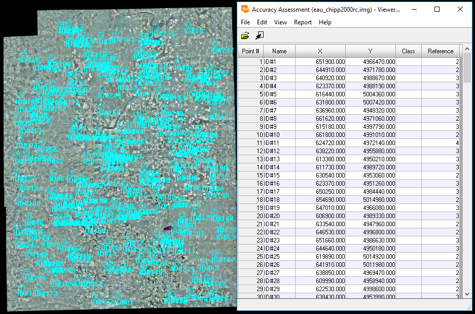
Fig 1: Making Sure All of the Accuracy Assessment Points Have a Truth Value
Step 2: Creating the Error Matrix
  The error matrix is created by navigating within the Accuracy Assessment window to Report → Accuracy Report.... This produces a report file which can be seen below in Figure 2. This report contains all of the information regarding the overall accuracy, Kappa statistics, producer's accuracy, and the user's accuracy for the classified image. To make an easier to read report, the important information from this report was transposed over into Excel to create an error matrix.

Fig 2: Error Report for Unsupervised Assessment Points
After creating this error matrix in Excel for the unsupervised classified image, the same process was used to created an error matrix in Excel for the supervised classified image.


Results

  Figure 3 shows the error matrix created for the classified image created using unsupervised classification as performed in Lab 3. 

Fig 3: Error Matrix for Classified Image using Unsupervised Classification
  The overall accuarcy of the LULC classification using the unsupervised method is 69%. This is not very good. Generally one would like to classify and image with at least 85% overall accuracy. Looking at the producer and user accuracy, it appears that the bare soil LULC class performed the worst among the LULC classes. This is because it was the most difficult to identify the bare soil when performing the supervised classification as the only part of the image delineated as bare soil were areas that had bare soil, such as around the airport runway. Fallow agriculture fields were classified as agriculture because that is their general land use. It appears that the water LULC class classified the best. It should be noted that the user accuracy is significantly lower for both the urban/built up and bare soil LULC classes than the producer's accuracy is for the classes. The overal Kappa statistic is 0.5706 which means that there was moderate agreement between the accuracy.

  Figure 4 shows the error matrix created for the classified image created using supervised classification as performed in Lab 4.
Fig 4: Error Matrix for Classified Image using Supervised Classification


  The overall accuracy of the LULC classification using the supervised method is 60%. This is not very good either and would be unacceptable if this map were to be used for anything other than for learning how to create a LULC image. Among the LULC classes, water classified the best, followed by forest. The producer's and user's accuracy has the greatest difference between the agriculture, and urban/built up LULC. Urban/built up LULC most likely didn't classify well because the spectral profiles for the training samples (seen in Figure 4 of Lab 4) were not uniform at all. The overall Kappa statistic for this classification is .4582 which means that there was moderate agreement between the accuracy.
  For some reason, the image classified using unsupervised classification had a higher accuracy than the image did which was classified using supervised classification. This is most likely because the image alarm was only used for the water training samples and not for the other LULC samples. Using the image alarm more would have helped to identify the training samples which needed to be refined. Also, the training samples weren't refined all that much in Lab 4. If these training samples had been more homogeneous and of higher quality, it is likely that the supervised classification would have produced  a more accurate classified image that the unsupervised method did.


Sources

United States Geological Survey. (2017). Earth Resources Observation and Science Center
Wilson, C (2017) Lab 5 Accuracy Assessment of Image Classification retrieved from
    https://drive.google.com/open?id=1iSUmx73tjWWJGctIyu5oeHLk90w8ZKTc

Friday, March 9, 2018

Lab 4: Supervised Classification of Landsat 7 ETM+ Imagery

Introduction

  The goal of this lab is to to perform supervised classification using Erdas Imagine to produce a land use land cover (LULC) map of Eau Claire and Chippewa counties in Wisconsin. Supervised classification consists of three main steps:
                                         1. Select the Training Samples
                                         2. Evaluate and Refine the Training Samples if Needed
                                         3. Run the Classifier 
Each section in the methods details one of these steps. The supervised classification in this lab is performed on a Landsat 7 ETM+ image captured on June 9, 2000. There are five LULC used to classify the image: water, urban/built up, forest, bare soil, and agriculture. Each pixel in the image will be classified as one of these LULC classes.

Methods

Step 1: Collecting Training Samples
  First, the Landsat 7 ETM+ NIR image was brought into Erdas. Then, the training samples were collected. The training samples are collected by creating areas of interest (AOIs) and then importing each AOI into the signature editor. To do this, one can click on the the AOI to select it in the viewer, and then click the "Create New Signature(s) from AOI" button, which has the symbol "+↳" in the signature editor window to make it a training sample.
  When collecting training samples it is important to collect quality samples. Quality training samples can be taken if the following guidelines are followed.
                                         1. Only allow samples to contain pixels which share the same LULC type.                                                                                           For example, it would be good to collect a training sample that has only a water LULC, and it                                                         would be bad to have a training sample contain water and urban LULC.
                                         2. Training samples should be at least 10 pixels in size because otherwise, a signature plot                                                               cannot be created for the sample.
                                         3. Training samples should be collected from all areas of the image being classified. Don't collect                                                     all samples from a small portion of the image.
                                         4. More Training samples should be collected where there is greater variably in the spectral                                                               profiles of the samples. For example, there should be more training samples collected for                                                               urban/built up than there should be for water.
                                         5. Training samples should include all of the spectral variability for a LULC class.
                                         6. Collect at least 5 to 10 training samples per class at the minimum.

  Figure 1 shows the water and forest training samples that were collected. In total 77 training samples were collected, 16 for water, 22 for forest, 13 for agriculture, 12 for urban/built up, and 14 for bare soil.

Figure 1: Signature Editor Window of Training Samples
Step 2: Evaluate and Refine the Training Samples
  There are a few different ways to evaluate the quality of training samples, in this lab, the histogram, image alarm, using a spectral plot, and looking at spectral separability.
  To use a histogram to evaluate the samples, one can click on the Display Window Histograms button in the signature editor window.  Then, the a histogram can be created for each spectral band included in the image, so because there are 6 reflective bands for Landsat 7 ETM+, there are 6 histograms created. One can create a histogram for a single training sample, or for multiple. It depends on the number of training samples highlighted in the signature editor window. Figure 2 shows the histgram values for all 6 bands for all of the water training samples. As one can see, most of the histograms are fairly normally distributed which is good. It is good to have the histograms normally distributed than it is for them to be bi-model. If 3 or more of the hisograms are bi-model. then, the training samples should be deleted and retaken until at least 4 bands display a normal distribution.
Fig 2: Histogram for all Water Training Samples for all Six Bands
 Image alarm allows one to see the computer take a guess at what pixels will be classified depending on which training samples are highlighted. One can access image alarm in the signature editor window by first highlighting the training samples in the signature editor window for which one wishes to have the computer estimate the classificaiton and then by navigating to View → Image Alarm → Edit Parallelepied Limits → Set → Signatures Selected → Ok. Figure 3 shows what using the image alarm looks like when using the water training samples to estimate the classification. The water appears to line up very nicely with the water in real life, so this means that the water training samples were good. If areas other than water were highlighed in turquoise, then only would should go through and recollect the training samples for that LULC class.

Fig 3: Water Image Alarm
  Next, the signature mean plots were used to see if the training samples were of good quality, To access the spectral plots for selected training samples, one can click on the Display Mean Plot Window button. Figure 4 shows the spectral mean plots for all of the signatures collected for each of the LULC classes. It is ideal to have all the spectral plots line up very similarly, much like the agriculture LULC plot shows below. If the signatures do not line up or are not uniform, then one should revisit the image alarm and histogram analysis to determine whether the signature should be kept or deleted.

Fig 4: Spectral Plots for the LULC Training Samples
   Looking at the spectral plots, there appears to be some variability in the urban/built up LULC class plot, and a bit in the forest LULC plot. The water, bare soil, and agriculture LULC plots all look uniform which is was is intended. Because the urban/built up and forest LULC plots are not uniform, the histograms and image alarm were revisited for these classes. After looking at these it was determined that the samples should be left in as they are all part of their respective LULC class.
  The last thing to evaluate the quality of the training samples is the separability between bands. This can be determined by generating a separability report. A separability report is created by navigating to Evaluate → Separability in the signature editor window, and then by chaning the number of layers to 4. This makes sure the report will determine which 4 bands provide the greatest separability. The report also generates a value which can be found under the Best Average Separability section of the report. This is the most important part of the report. This part of the report for this lab's training samples can be seen below in Figure 5. 

Fig 5: Best Average Separability Report
The numbers on the left (1, 2, 4, and 5) represent the bands which will provide the most separability between differentiating the LULC classes with the provided training samples. the number 1964 represents the quality of the training samples. If that number is above 1900 then the training samples were of good quality which in this case is true. If this number is above 2000, then the quality of the training samples is excellent. If this number is below 1700, then the quality of the training samples is poor. If one records a value below 1700, then he or she should recollect many if not all of the training samples.


Step 3: Classify the Image Using the Supervised Classifier
  This is done by first merging all of the training samples for each LULC class into their respective classes to create 5 signatures. Then, the names of these merged signatures/training samples were named to their respective LULC classes. Then, the signature file was saved.
  Then, the Supervised Classification window was opened inputting the original Landsat 7 ETM+ image into the input raster, the saved merged signature as the input signature file, and then naming the output file. The classifier chosen was the Maximum Likelihood classifier. These parameters can be seen below in Figure 6.

Fig 6: Supervised Classification Input Parameters

  Lastly a map of the output image was created in ArcMap.


Results

  The result of performing the supervised classification can be seen below in Figure 7.

Fig 7: LULC Map of Chippewa and Eau Claire Counties for the Year 2000

  This map looks very similar to the map created using unsupervised classificaiton. Overall, by just visually looking at the LULC map and knowing what the LULC is for the area, the output image is ok. The largest difference in this LULC map from the LULC created in Lab 3 is that there is a lot more area classified as bare soil in this map. This is because in this lab, fallow agricultural fields were trained and chosen to be classified as bare soil whereas in Lab 3, these fallow fields were chosen to be classified as agriculture LULC.


Sources

United States Geological Survey. (2017). Earth Resources Observation and Science Center
Wilson, C (2017) Lab 3 Unsupervised Classification Data retrieved from
     https://drive.google.com/open?id=1w2WHUATIj8EfztCA0o6iD8Zv2tdpfvm2 

Thursday, March 1, 2018

Lab 3: Unsupervised Classification

Introduction

  Unsupervised classification is a fairly quick way to extract surface uses from a study area. Unsupervised classification requires minimal input from the user and doesn't require any knowledge of the study area prior to processing data. This lab details how unsupervised classification is performed within Erdas Imagine 2016. Two different sets of parameters will be tested and then both outputs will be assessed.  For this analysis, the imagery used will be a Landsat 7 ETM+ image captured on June 9th, 2000 of Eau Claire and Chippewa counties in Wisconsin. After performing unsupervised classification, a map of the LULC classes will be created in ArcMap.

Methods

Experimenting With Unsupervised Classification

Step 1: Run the Unsupervised Classification Algorithm
 This is done by opening the unsupervised classification window by navigating to Raster → Unsupervised → Unsupervised Classification. In this window, the Isodata radio button is checked, and the following parameters were set as shown in Figure 1. Then, the tool was ran.
Fig 1: Unsupervised Classification Window and Parameters

Step 2: Assign LULC Classess to the Generated Classes
  Step 1 generated an output image with 10 different classes. This can be seen below in Figure 2 along with the attribute table. These classes / attributes were then classified into 5 LULC classes by changing the colors of the classes and by using 2005 imagery from Google Earth Pro as a reference. Often, the class fell into multiple actual LULCs. However, the analyst did the best to make sure that the class represented the LUL . The following LULC classes were classified and assigned the following color:

  • Water (Blue)
  • Forest (Dark Green)
  • Agriculture (Pink)
  • Urban / Built up (Red)
  • Bare Soil (Sienna) 
  After reclassifying the image, the image was saved as a new raster.

Fig 2: Output from Unsupervised Classification Tool

Improving the Unsupervised Classification

Step 1: Run the Unsupervised Classification Algorithm
  To improve the unsupervised classification, some of the parameters were changed in the Unsupervised Classification window as shown below in Figure 3. The convergence threshold was changed from .95 to .925, and the number of classes generated was changed from 10 to 20.

Fig 3: Making Changes to the Unsupervised Classification Parameters
Step 2: Assign LULC Classess to the Generated Classes
  Step 1 generated an output image with 20 different classes. These classes were then assigned to one of the five LULC classes just like in Step 2 of the first run through. Once again, Google Earth was used as a reference to classify the LULC classes.

Step 3: Reclassifying the Raster
  The next step was to reclassify the raster. As of now, each of the 20 classes is assigned a color as to whether it is urban / built up, agriculture, bare earth, forest, or water. These LULC classes can be aggregated into just 5 classes instead making it easier to create a map in ArcMap. This is done by navigating to Raster → Thematic → Recode and then by assigning the appropriate LULC name to each of the 20 classified values. Figure 4 shows what the attribute table looks like after assigning the LULC its name.
Fig 4: Using the Recode Tool to Reclassify the Raster

  Then, a new field was created in the raster table to assign a label to each of these values. A new field was added to the table by navigating to Edit → Add Class Names and then by changing the labels in these cells to reflect its corresponding LULC. Then name of this field was changed to "Class name".  This can be seen below in Figure 5.
Fig 5: Assigning the Values its Appropriate LULC Label
Lastly, a map of the improved LULC raster was created in ArcMap.

Results

  Figure 6 is a screenshot of the first attempt at creating a LULC image. The accuracy of these classifications is not very good. Many areas that are urban / built up are classified as agricultural and many areas that are agricultural are classified as urban / built up. Another common error is that many agricultural areas got classified as bare earth. Overall though, this image does a good job of generalizing the LULC for Eau Claire and Chippewa counties.
Fig 6: First Attempt at a LULC Classification

  Figure 7 is a map of the output of the improved LULC for Eau Claire and Chippewa counties.  There is less of a salt and pepper effect in this image, especially when analyzing the bare earth land cover. In comparing the two LULC outputs, the improved one is better because it is smoother and less areas are misclassified. This is because there were 20 classes generated from the Unsupervised Classification tool rather than 10, and because the conversion threshold was lowered. 

Fig 7: Map of LULC of Eau Claire and Chippewa Counties in the Year 2000

Sources

United States Geological Survey. (2017). Earth Resources Observation and Science Center
Wilson, C (2017) Lab 3 Unsupervised Classification Data retrieved from
     https://drive.google.com/open?id=1tbBaoMEQybAzqeuxnrfgL6Xpvcqm25em

Friday, February 23, 2018

Lab 2: Absolute and Relative Atmospheric Correction

Introduction

  This lab covers three different atmospheric correction methods. One is relative and two are absolute. The absolute methods include the Empirical Line Calibration (ELC) and the Dark Object Subtraction (DOS) method, and the relative method is the Multidate Image Normalization method. For the ELC and DOS methods, Landsat 5 imagery will be used from the Eau Claire area. For the Multidate Image Normalization method Landsat 5 imagery centered around Chicago will be used.

Methods

Empirical  Line Calibration (ELC)
  Empirical Line Calibration is performed by using the equation: CRk = DNk * Mk + Lk where:

  • CRk = corrected digital output pixel values for a band (k)
  • DNk = the image band(s) to be corrected
  • Mk = a multiplicative term affecting the brightness values on the image*
  • Lk = an additive term*
      *Note: Mk and Lk are obtained by getting the gain (Mk) and offset (Lk) values from deriving a linear equation by comparing in in situ reflectance values with those obtained by the sensor. A spectral library can be consulted if in situ reflectance values cannot be obtained.

Fig 1: Emperical Line Equation and Graph
  To perform ELC on the Landsat 5 Eau Claire image, first, the Spectral Analysis Workstation was opened up. Then, the method was changed to Empirical line because Erdas defaults to Modified Flat Field. Then, the regression equation was created by creating spectral signatures for roadway, coniferous forest, grass, aluminum roof, and water. and then comparing their spectral signature to its spectral signature from the ASTER library, or USGS library.
  After collected each of these and comparing them to their respective spectral signature in the library, a linear equation for each band was made. The graph of this equation for band 7 can be seen to the right in Figure 1. This figure also contains the slope and intercept information which will be used to derive an atmospherically corrected image.
  To use this model to create the corrected image, the View-Preprocess-Atmospheric Adjustment button was clicked and then the output was saved.
  Then, spectral profiles were compared with each other from the original image to the atmospherically corrected image. This was done for the roadway, coniferous forest, grass, aluminum roof, and water surfaces.


Dark Object Subtraction (DOS)
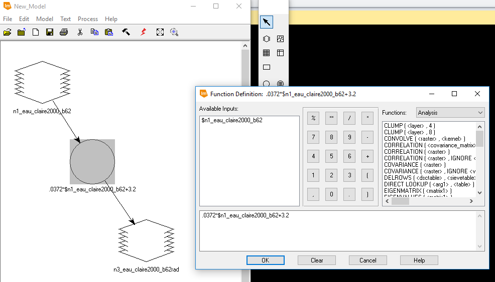
  Dark Object Subtraction correction takes into account a few more variables than ELC correction does. It accounts for sensor gain, offset, solar irradiance, solar zenith angle, atmospheric scattering and absorption, and path radiance. DOS is a two step process. The first step is to convert the raw imagery to at-satellite radiance which is done by using the equation L = (LMAX - LMIN) / (Qcal max - Qcal min) * (Qcal - Qcal min) + LMIN where:

  • L = the at-satellite radiance
  • Qcal = Landsat image
  • Qcal min = found in meta data
  • Qcal max = found in meta data
  • LMAX = found in meta data
  • LMIN = found in meta data
  This equation was used on the Landsat 5 image of Eau Claire. The model maker equation can be seen in Figure 2 along with the model itself. The equation for band 1 is displayed in the Function Definition window.
Fig 2: Calculating At-Satellite Radiance Using Model Maker
  The second step is to convert the at-satellite radiance image to true surface reflectance. This is done by using the equation R = π * D² * ( L - Lhaze) / (TAUv * ESUN * Cos(Θ) * TAUz) where

  • R = true surface reflectance
  • π = the number pi (3.1415926535)
  • D² = the distance between the earth and sun squared in astronomical units
  • L = the at-satellite radiance image
  • Lhaze = path radiance
  • TAUv = atmospheric transmittance from ground to sensor
  • Esun = the mean atmospheric spectral irradiance
  • Cos(Θ) = the cosine of the sun zenith angle
  • TAUz = the atmospheric transmittance from the sun to the ground

  This equation was applied to the at-satellite radiance image from above and from the meta data from the Landsat 5 image and then was performed in Model Maker which can be seen below in Figure 3. The equation for band 1 can be seen in the Function Definition window. Next, a layer stack was performed on the output bands to create a composite. Then, radiometric differences were looked at between the original Landsat 5 image and the DOS atmospherically corrected image.


Fig 3: Calculating True Surface Reflectance Using Model Maker

Multidate Image Normalization
  Multidate Image Normalization normalizes one image to another. The images were taken at different times. For this analysis, the Landsat image of Chicago from 2009 will be normalized to the the Landsat image of Chicago from 2000.
  The first step to perform Multidate Image Normalization is to create spectral profiles for both images. Then, by exporting the mean values from the bands into Excel, a linear regression equation can be created: Lsensor = Gain * DN + Bias where

  • Lsensor = the normalized at satellite radiance image
  • Gain = the regression coefficient determined by the the spectral profiles
  • DN = the band to be used (the 2009 bands in this case)
  • Bias = the y intercept of the calculated equation from the spectral profiles
  Figure 4 shows the Exported Excel data which was used to created the equation. The numbers in the columns are the mean values of the 15 spectral profiles which were created.
Fig 4: Excel Mean Data
  To get the linear equation as described above, a graph of each of the bands was created. Figure 5 shows the graph with the equation [The normalized 2009 band 3 = 1.6377 * (The Chicago 2000 band 3) + 4.1127]  for band 3.
Fig 5: Band 3 Graph
Fig 5: Band 3 Graph
  The equation for each of the 6 bands was determined using this method. Then, these equations were plugged into a model in Model Maker as shown below in Figure 6. The equation for band 1 can be seen in the Function Definition window. Then, a layer stack was performed to create the normalized 2009 image.
Fig 6: Model for Normalizing the Chicago 2009 image to the Chicago 2000 image

Results

Figure 7 shows the results of the ELC atmospheric correction. This image doesn't appear any different than a regular nir Landsat image from this view, but slight differences can be seen when comparing spectral profiles.

Fig 7: ELC Atmospherically Corrected Image
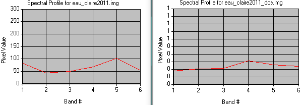
  Figure 8 shows the spectral profiles for both the ELC corrected image and the regular image for a road surface. The graphs show that reflectance is lower in the blue band in the ELC corrected image than in the regular image.
Fig 8: Comparing Spectral Profiles
  Figure 9 shows the result of the DOS correction method. Once again, this image doesn't look any different from this view than a regular nir Landsat image. To see the difference better the spectral profiles can be looked at.
Fig 9: DOS Atmospherically Corrected Image
  Figure 10 shows the spectral profiles of a road for the DOS corrected image and the regular image. Similar to the ELC mehod, the DOS method causes there to decrease reflectance in the blue band.

Fig 10: Comparing Spectral Profiles
Fig 10: Comparing Spectral Profiles 
  Figure 11 shows the output of the Multidate Image Normalization. Visually, this image actually looks different from its original image, but not by much. To see the actual change in the images the spectral profiles were looked at.

Fig 11: Normalized Chicago 2009 Image
  Figure 12 shows the spectral profile of water for the normalized image and the original image. The graph shows that overall, the brightness values changed very little with a notable exception that there is a greater reflectance in band 5 than compared to to bands 4 and 6 in the normalized image than in the original image.

Fig 12: Analyzing Spectral Profile of Water


Sources

Nasa. (2016). ASTER Spectral Library
United States Geological Survey. (2017). Earth Resources Observation and Science Center
United States Geological Survey. (2016). USGS Spectral Library
Wilson, C (2017) Lab 2 Radiometric and Atmospheric Correction retrieved from
     https://drive.google.com/open?id=1qs7ux8sXMDumARV_Lq-YV2oKk8gNc7oV

Thursday, February 8, 2018

Lab 1: Surface Temperature Extraction from Thermal Remote Sensing Data

Introduction

  This lab looks at calculating surface radiant temperature by using the thermal bands of satellite imagery captured by Landsat TM, ETM +, and 8. The wavelength of the thermal band in Landsat TM and ETM+ is 10.4 µm to 12.5 µm and the wavelength of the thermal band for Landsat 8 is 10.6 µm to 11.19 µm. There are three main steps to convert the thermal bands to a kinetic temperature surface. the first is to convert the thermal band to at satellite spectral radiance, the second is to convert the at satellite spectral radiance to radiant temperatures, and the third is to convert the radiant temperatures to kinetic temperatures. This process is detailed below for all three sensors.

Methods

  As stated above, converting thermal bands to a temperature surface is a two step process. The first step is to use the thermal band to determine the at satellite spectral radiance. All of the variables can be found in the meta data files for the This is done by using the equation Ll = Grescale * DN + Brescale where:
  • Ll is the at satellite spectral radiance (a raster output)
  • Grescale is (LMAX-LMIN) / (QCALMAX-QCALMIN)
  • DN is the thermal band
  • Brescale is LMIN
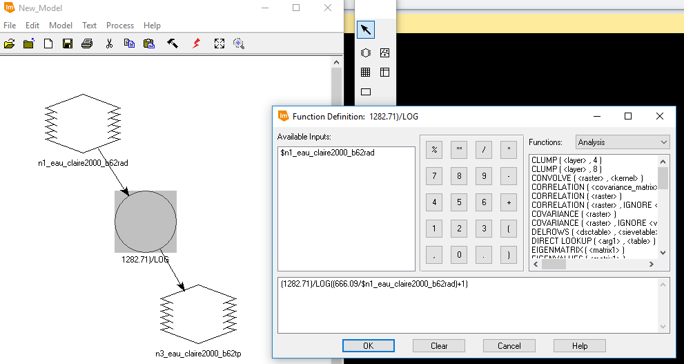
  Once one has at satellite radiance (Ll) one can the advance to step two and calculate the radiant temperature. This is done by using the equation Tb = K2 / Log( [K1/Ll] + 1) where:
  • Tb is the radiant temperature (°K)
  • K1 and K2 are calibration constants
  • Ll is the at satellite spectral radiance raster

Calculating Surface Radiant Temperature with ETM+

  This is done by using the model maker in Erdas Imagine. Two separate models were created for this sensor, one for each equation above. Figure 1 shows the first model where the at satellite spectral radiance was calculated. The LMAX, LMIN, QCALMAX, QCALMIN values were all looked up in the meta data text file in Notepadd ++.
Fig 1: Calculating the at Satellite Spectral Radiance
  Then, the output raster from the above model was used in the second model as seen below in figure 2. To help see the equation used in the function, the window is left open. This is where the radiant surface temperature raster is calculated.
Fig 2: Calculating the Radiant Temperature from the At Satellite Radiance

Calculating Surface Radiant Temperature with TM

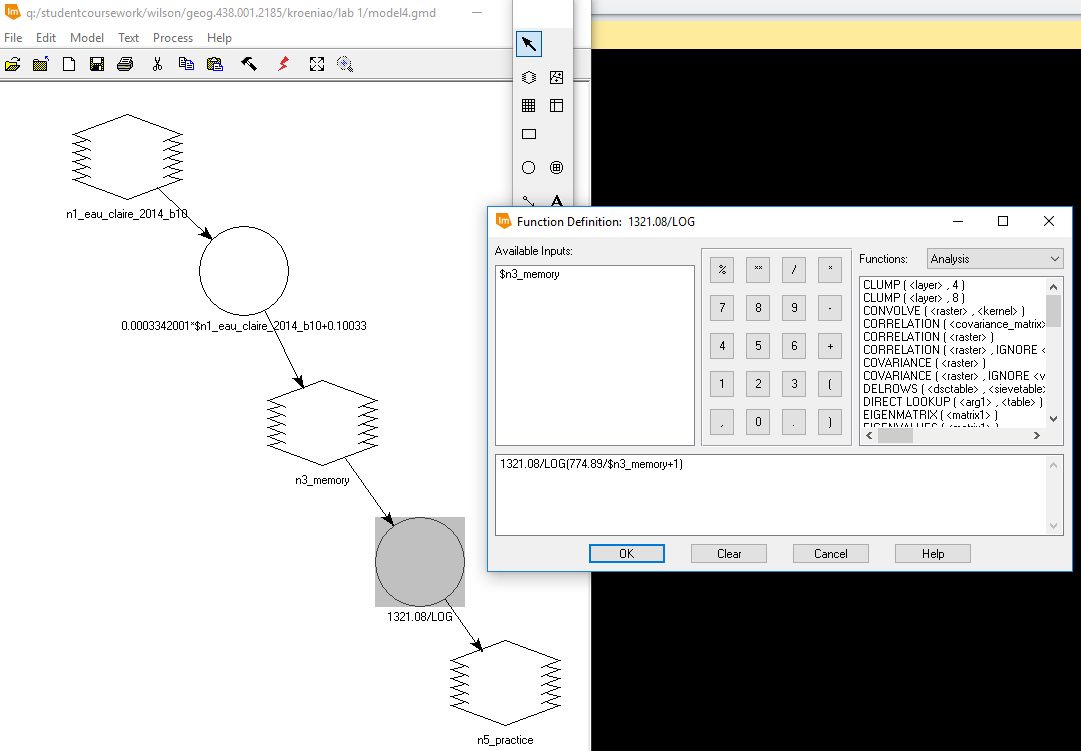
  This was also done by using the model maker in Erdas. Instead of using two models to create the surface radiant temperature raster, it was combined into a single model. This can be seen below in Figure 3. There are two functions in the model. The first one, calculates the at satellite spectral radiance. The output of the first function is a temporary raster which is stored in memory. Then, this temporary raster is used in the second function which calculates the radiant surface temperature. This output is stored as float single.The data for the inputs was found by using the meta data file.
Fig 3: Model for Calculating Surface Radiant Temperature
 Calculating Surface Radiant Temperature with Landsat 8

  Just like with the TM satellite data, the Landsat 8 thermal band was used the same way to calculate the radiant surface temperature in a single model. This model can be seen below in Figure 4. The first function calculates the at satellite spectral radiance and stores the output as a temporary raster, and the second function is used to calculate the radiant surface temperature with a float single data type. The data for the inputs was found by using the meta data file.
  Next, a subset of this raster was created so that only Chippewa and Eau Claire counties were included. Then, once brought into ArcMap, the raster values were converted to °F, and the extract by mask tool was used to help the raster have the defined boundaries of the counties. This helps to get rid of false data values outside the study area.


Fig 4: Calculating Radiant Surface Temperature for Landsat 8

Results

ETM+
  Below is a screenshot of the surface temperatures calculated on June 6th, 2000. When the data was brought into ArcMap, there were a bunch of false values that showed up the outside the satellite scene. This value of 237.218 was set to display no color. Because the classification scheme used was stretched, this value still plays a factor for the other hues representing the other temperatures. The highest temperature in the scene is 317.945 °K and the lowest temperature is 288.450. The lowest temperature is a rough estimate because of all the false values. This raster shows that there tends to be higher temperatures in urban areas and cooler temperatures in rural areas.
Fig 5: ETM+ Radiant Surface Temperature Image
Landsat TM
  Below is a screenshot of the surface temperatures calculated on August 3rd, 2011. When the data was brought into ArcMap, there were a bunch of false values that showed up the outside the satellite scene. This value of 203.371 was set to display no color. Because the classification scheme used was stretched, this value still plays a factor for the other hues representing the other temperatures. The highest temperature in the scene is 321.309 °K and the lowest temperature is 295.681. The lowest temperature is a rough estimate because of all the false values. Also, because of the extreme low values for both rasters, although the actual values of the pixels in the scene are similar, it is difficult to draw comparisons visually because of the difference in color. This raster shows that there tends to be higher temperatures in urban areas and cooler temperatures in rural areas.
Fig 6: TM Radiant Surface Temperature Image
Landsat 8
  Below is a map created from the radiant surface temperature on May 23rd, 2014 from Landsat 8. Unlike the above rasters, this one didn't contain a bunch of false values because the extract by mask tool was used, so the color scheme helps to visualize the raster well. The lowest temperature is 50.45 °F and the highest temperature is 111.2 °F. In general, lower temperatures are located more in the north east and where water bodies are present, and higher temperatures are located more in the west and south.
Fig 7: Landsat 8 TM Radiant Surface Temperature Image


Sources

Bureau, U.S (2017). factfinder.census.gov. Retrived from american Fact Finder
     https://factfinder.census.gov/faces/nav/jsf/pages/searchresults.xhtml?refresh=t
United States Geological Survey. (2017).Earth Resources Observation and Science Center
Wilson, C (2017) Lab 1 Surface Temperature Extraction from Thermal Remote Sensing Data retrieved from
     https://drive.google.com/file/d/1ffHly8Z1ELm1RavcUFlM0IXvUbgbTSfI/view?usp=sharing